Preset 1: Out of the box
Random order is entirely optional, it's only for demonstration purposes. The gallery takes up as much space as it can, however the 100% width is a feature of the theme.
Preset 2: Author's favorite
The dark background is a feature of the theme. Your gallery will be on the background you have for your content. This preset is best on a dark page.
Preset 3: Flickr style
Similar to what you see on Flickr nowadays, in terms of general look & feel. Quick animations, no overlay.
Preset 4: Google+ style
This uses bigger images so they show detail even without opening them. Captions are light, animation is very quick.

Preset 5: Fixed height, no fancy
Rows have fixed height like Google image search. A little cropping occurs to make it happen. Animation and text are off by default.
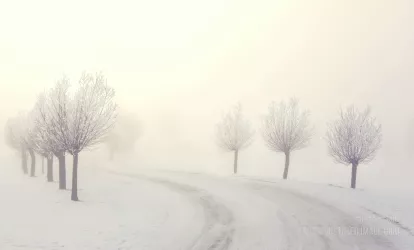
Preset 6: Artistic-zen
A smooth and calm look for you to enjoy. Light captions with everything desaturated even on hover.

Preset 7: Color magic fancy style
How far will you go? Have vivid colors all over, whatever fits your style! Use strong styles to deliver your message.
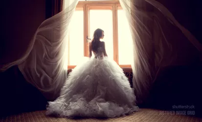
Preset 8: Big images no click
Almost transparent overlays and very light, thin captions. Large thumbs so you can get away without a lightbox.
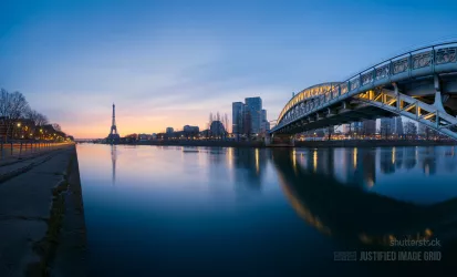
Preset 9: Focus on the text
The bigger and stronger captions are in focus now. Thumbs desaturate and darken on hover to pave the road for the slide-in description.
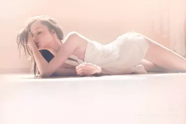
Preset 10: Hidden
There are 20 images, but only up to 10 are shown and the rest is available in the lightbox. Incomplete rows get hidden. Great for Facebook or other sources with many photos.

Preset 11: Magnifier blur
A very strong orton effect blurs the thumbnails while the original edges are somewhat see-through.
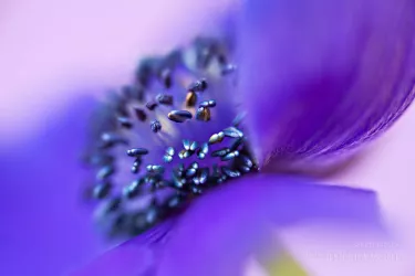
Preset 12: Author's other favorite
The effects and inner shadows gently fade away as you bring the mouse over. The result is nicely highlighted in the dark environment.
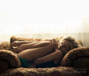
Preset 13: Orton effect
Simulated orton effect works by mixing the blurred picture with the original. Reverts on mouse over! In photography the effect is stronger due to using different photos.
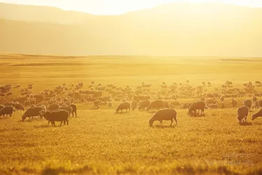
Preset 14: Animated border and glow
An impression of growing photos is achieved by a retracting border. The glow boosts the light areas of the images further than the original picture. Works well on dark and nature photos.
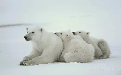
Preset 15: Borders and shadow
This preset has five effects on and around the pictures: inner/outer shadow and inner/middle/outer border. All used together to yield a familiar, framed look.

Preset 16: Facebook inspired
The very thin inner border is inspired by Facebook. Elegant, sliding captions and magnifying glass complete the picture.
Preset 17: Vertical center
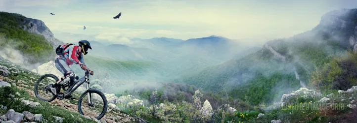
The text is aligned to the center of the thumbnails both horizontally and vertically. It's a quick way to using this style of combined settings.
Preset 18: Vertical creative
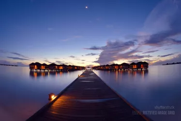
A little bit more creative approach to the vertical centering. You can change the colors, this is just a sample (you are not limited to purple, of course).

Preset 19: Caption fun, gray background
Captions can also have the background only behind their title text. A gray area appears during loading as a placeholder for each picture.
Preset 20: Caption below the thumbs
Caption height is adjustable to accommodate most of your text. Excess words are automatically trimmed with ellipsis… Links are supported in the text as it's not part of the thumbnail's link.
