The problem with many, many galleries is fixed cropping


This is the default WordPress gallery. You don't have to be a photographer to tell that something is just wrong. You wonder how those people look like, but can't see them well. Ruining the composition of photos, even at a thumbnail level is unacceptable. It may not happen to every single picture, but why crop any detail? Likely most of your pictures are not squares. You could be limited by rectangular cropping in your current gallery. You don't see this on Facebook's square thumbnails because it crops by detecting faces. Fortunately, there is a solution called justified layout. It looks cool and shows photos as they were shot!
The obvious solution is Justified Image Grid


Justified Image Grid respects the original aspect ratio. No detail is lost due to cropping. The justified layout is automatic. You can turn all your pre-existing and future WordPress galleries into this look with a single setting, if you prefer. Revert if you change you mind. Keep the workflow you already know! Gain visual advantage easily.
It's that simple, but the power is there if you need more
The underlying logic has a vast amount of control. It ensures you get the best possible look. Settings are not forced on you, all have their defaults and presets utilize them in various ways. Let's see the fine details of the justified layout.
- You can set a target row height, and a +/- deviation to control row heights. Depending on the pictures, the rows will be scaled dynamically. It keeps portrait images significant among landscape shots by making rows with portrait images taller than others.
- Use different row height settings for mobile users to ensure the best use of the justified layout.
- Minor cropping can occur with a tight row height deviation. However, a setting can disable cropping by allowing more freedom.
- Hide the last row, if incomplete (orphan) or center it. Even match the look of previous row in case of a same aspect ratio.
- The grid is a pixel perfectly aligned justified layout at all times, like a paragraph.
- The overall width of the gallery can be responsive or fixed. There is ability to choose different behavior on mobiles vs. desktops.
- Set the number of images visible in the gallery. Show extra images only in the lightbox or limit to a maximum number of rows.
- Control the spacing between images and around the gallery.
- Right-to-left (RTL) layout is supported for actual thumbnail order (not just for text align).
- Error checking to pop missing images from the grid, providing an uninterrupted experience.
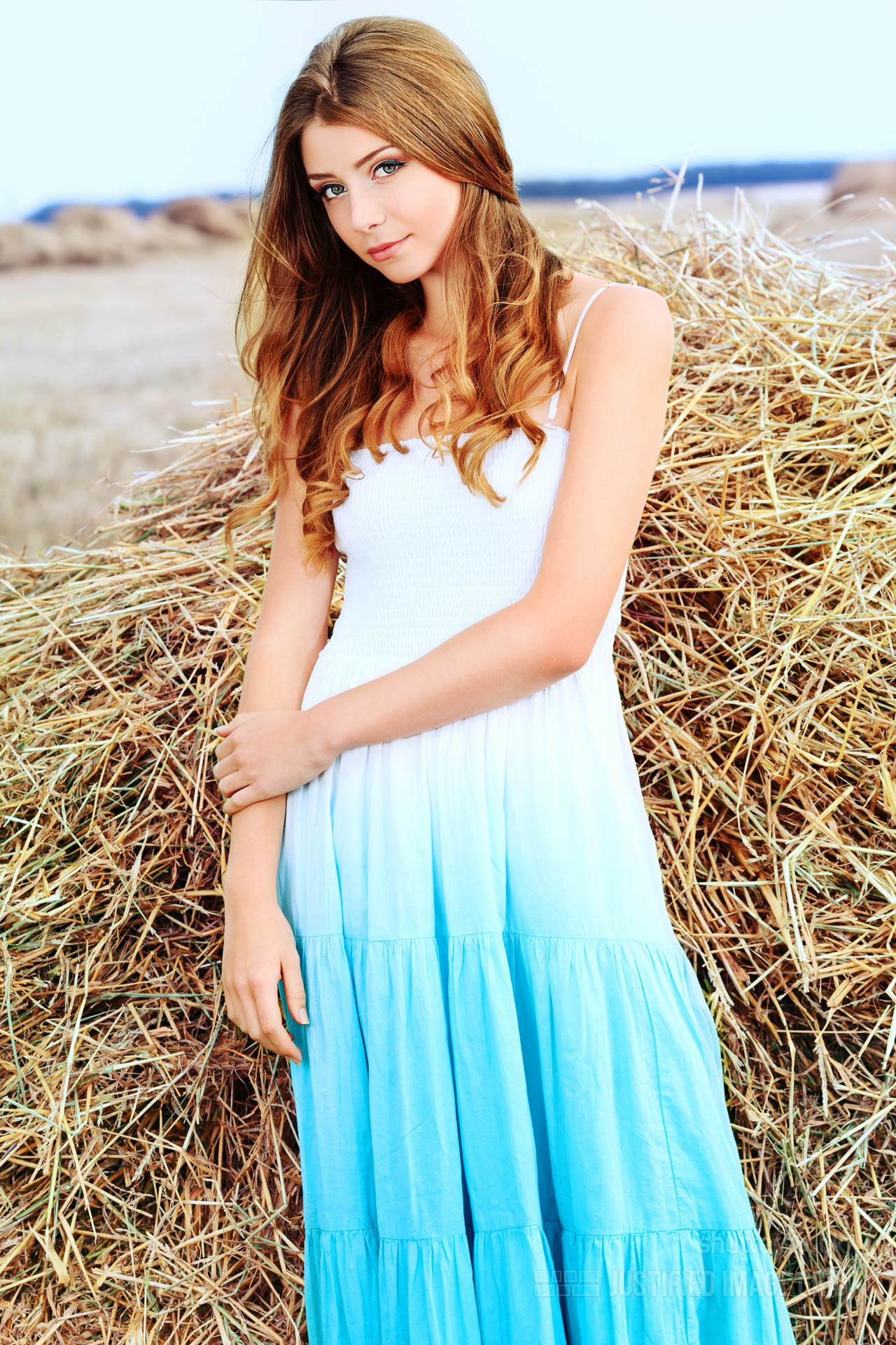
Centering one or more images
This is the incomplete last row setting. It allows to center images when they can't fill the available space due to controlled row heights.
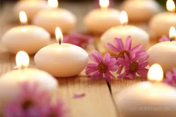

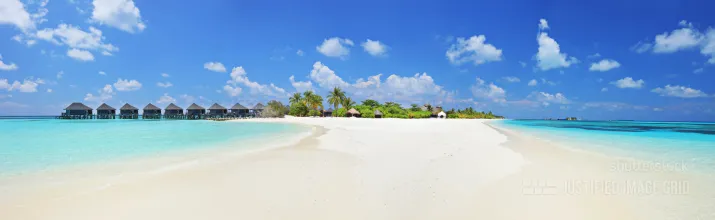
The above examples use the following, generated shortcodes (how to use):[$justified_image_grid preset=19 last_row=center ng_pics=603,604]
[$justified_image_grid preset=4 last_row=center ng_pics=566]
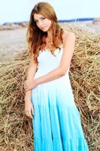
Letting some text flow on the right side

So what is the justified layout? A common type of text alignment in print media is "justification". The spaces between words, and, to a lesser extent, between glyphs or letters, are stretched or compressed to align both the left and right ends of each line of text. When using justification, it is customary to treat the last line of a paragraph separately by simply left or right aligning it, depending on the language direction. Lines in which the spaces have been stretched beyond their normal width are called loose lines, while those whose spaces have been compressed are called tight lines. Some modern typesetting programs offer four justification options: left justify, right justify, center justify and full justify. These variants specify whether the last line is flushed left, flushed right, centered or fully justified.
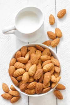
The above example uses the following, generated shortcode (how to use):[$justified_image_grid preset=3 ng_pics=727 wrap_text=yes]